We Were Promised Jetpacks: The Lost Future of Frutiger Aero

In the early 2000s, tech had a soul. Or at least, it felt like it did.
The aesthetic of the time, retroactively dubbed Frutiger Aero, painted a hopeful, hyper-modern picture of the future. It was named after the ubiquitous typeface Frutiger and the smooth, high-gloss airiness of UI design trends in Windows XP, early Android, and various airport terminals and inflight screens. It blended clean sans-serif fonts with glassy buttons, gradients that mimicked light refracting through water, soft shadows, and nature-themed backdrops that felt almost utopian.
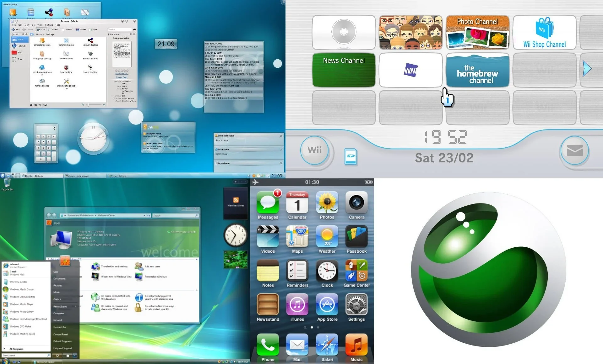
It was bubbly. Optimistic. Slightly naive. But it was trying. It cared.
There was an emotional tactility to everything. UI elements floated like plastic toys you could touch. Water, grass, air — all gently glossed over with a sense of wonder. We were on the cusp of the Jetsons’ world, and design wanted us to feel it.
And then, we killed it.
The Flat Design Apocalypse
September 18th, 2013. iOS 7. The day soul died.
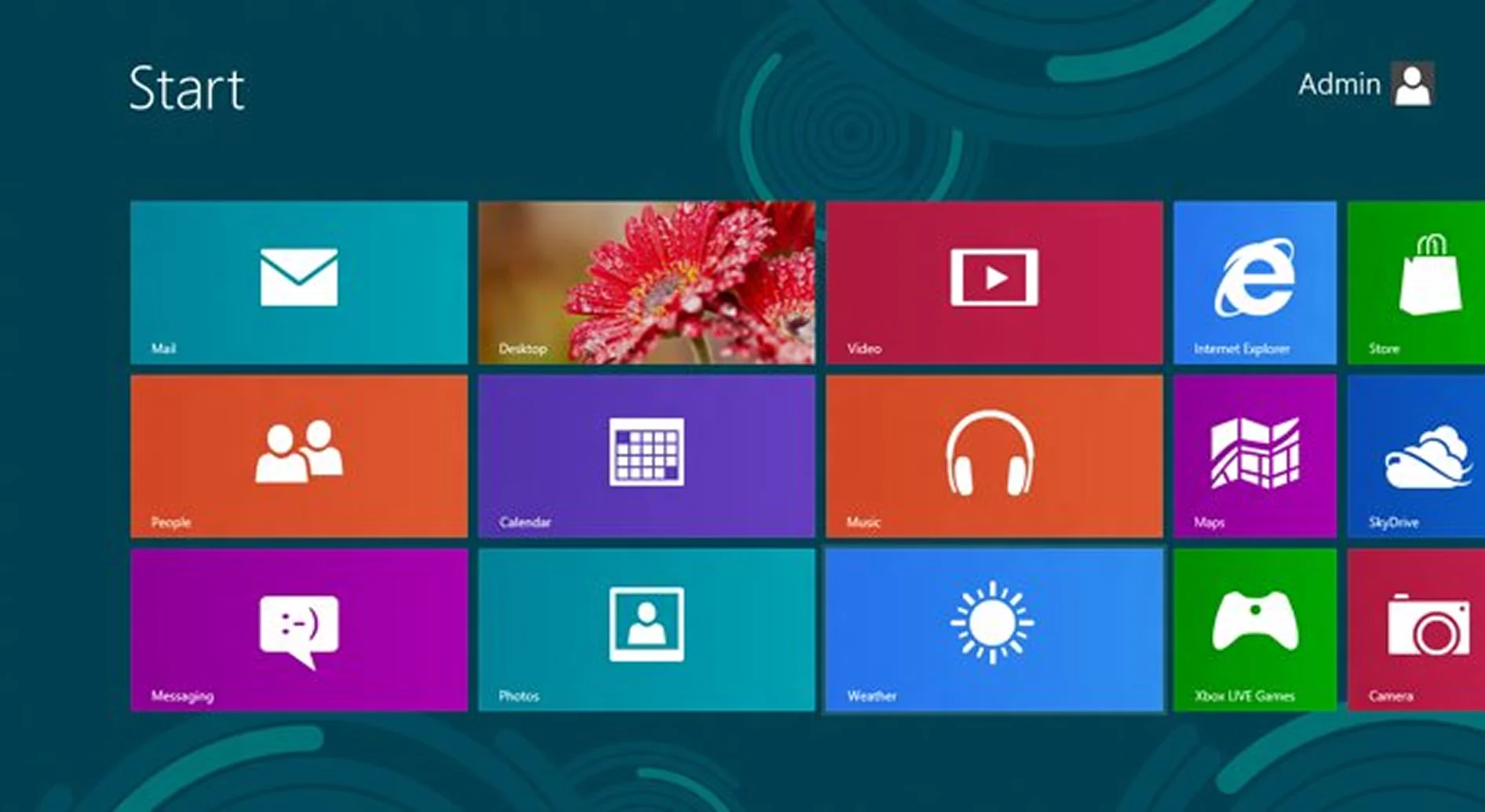
The decline of Frutiger Aero started in 2012 when Microsoft released Windows 8, but its final nail in the coffin was with Apple's release of iOS 7. Flat design came crashing in like a cold slap of Helvetica. Suddenly, buttons weren’t buttons. They were just words. Skeuomorphism was ridiculed, realism was labeled immature, and depth was declared obsolete.
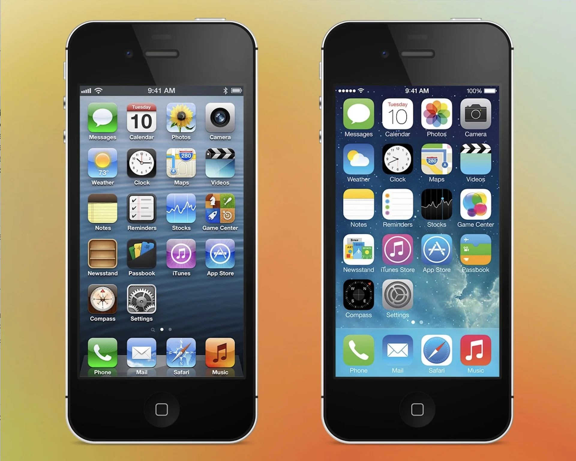
Designers embraced the minimalist, clinical approach of flat design. It was easier to scale. It was cleaner, yes, but also colder. The future went grayscale. Interfaces became austere and mechanical. Every app looked the same, with sans-serif type, primary color accents, and flat icons. If Frutiger Aero was a lucid dream, flat design was a spreadsheet.
Sure, it solved problems. But it created a bigger one: emotionless design. There was no texture. No humanity. Flat design didn’t invite you in — it expected you to adapt to it. Somewhere along the way, we lost joy. If I sound bitter, it’s because I am. The truth is, we did this to ourselves. There’s no villain here, just a collective decision that traded wonder for efficiency.
The Slow Return of Feeling: We are SO back
But something is changing.
In the past couple years, there’s been a quiet rebellion against sterile interfaces. Designers are rediscovering shadows, glass, layers, motion. UI elements that react to you, not just exist for you.
We’re seeing a new, restrained skeuomorphism emerge. Call it skumorposhim, if you will. A self-aware evolution. It’s not trying to make your calendar look like leather-bound paper. Instead, it’s leaning into tactile feedback, depth cues, texture, and light to guide interaction and emotion.
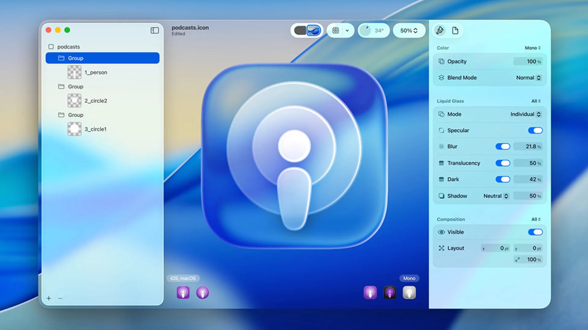
Even major platforms are embracing these shifts. Apple’s use of blurred glass in macOS, its new Liquid Glass language, neumorphism-inspired widgets, and the rise of playful UI elements in indie apps all reflect this trend. Designers are starting to realize that clarity and delight can coexist.
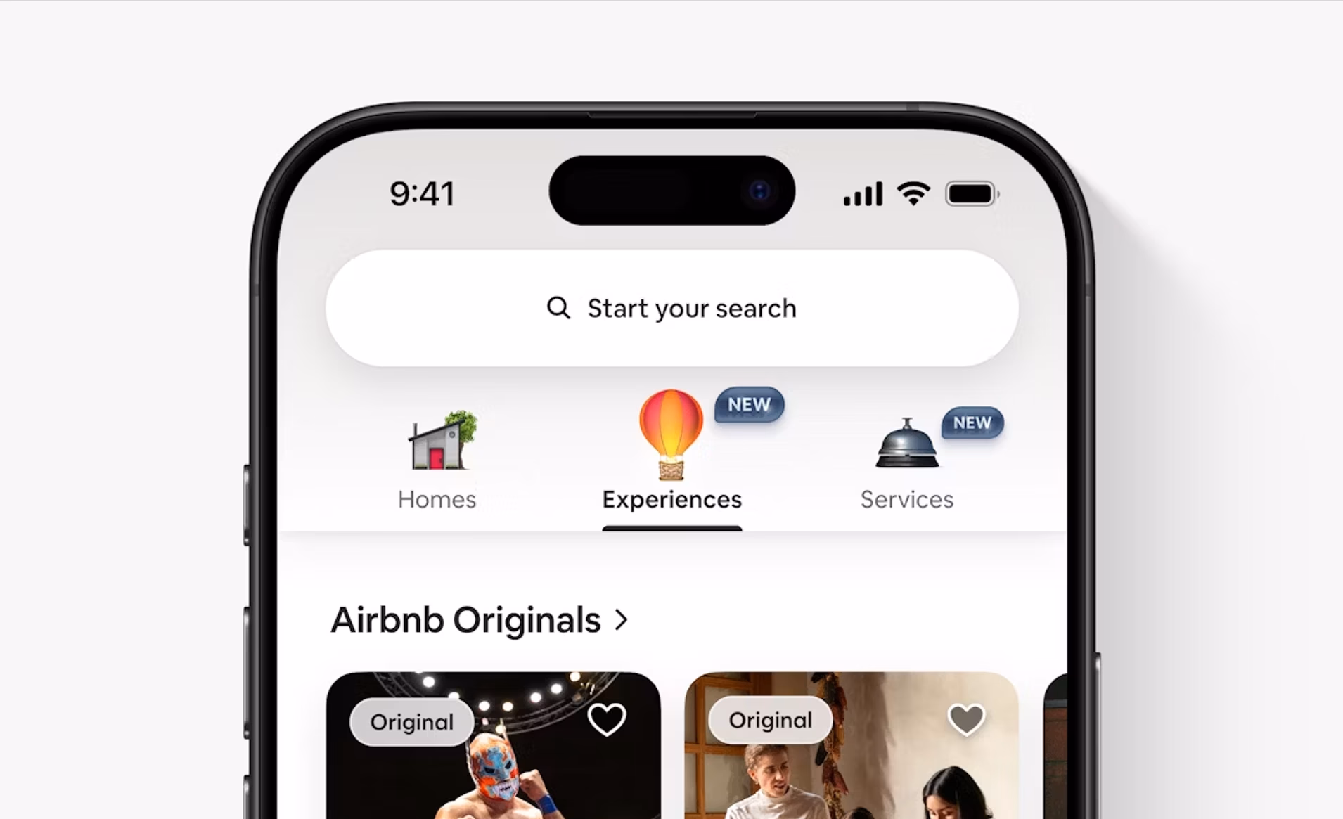
Even some of the same giants that once danced on skeuomorphism’s grave are stepping back onto the floor. Take Airbnb’s massive icon update earlier in 2025, a bold shift that reintroduces depth, warmth, and tactility. It’s a quiet admission that flat, while functional, might have flattened too much.
Hope in the Clouds: Frutiger Aero Is Whispering Again
Here’s what gives me hope.
We’re embracing motion again — not just for transitions, but to add character and rhythm.
We’re rediscovering materials — not skeuomorphic for nostalgia, but to make UIs more approachable and fun.
We’re bringing back nature — soft gradients, air, water, life.
Most importantly, we’re designing interfaces that feel alive again.
Frutiger Aero isn’t back in full force. But its spirit is rising. There’s something beautiful about blending its optimism with today’s sensibilities. A second chance at the future we once dreamed about.
So here’s to interfaces that breathe, to software that feels human, and to the design language that said, “Let’s make the future feel good.”
Maybe this time, we’ll get there.