Automancer is a concept jungle/dnb mix which takes you on an auditory journey alongside synthezoid militant Luna Automancer as she quests deep into the Mother Core on a journey of self discovery. I served as the Lead Creative Director, owning the entire visual direction of the project, from branding and character illustration to physical product design for the upcoming CD release.
Project Overview
This wasn't just an album release. Automancer was designed as an immersive experience, one that felt like it was pulled straight from 2006. The goal was to create something that looked and felt like it came from the early Y2K era, with a deep visual connection to the sound and story of the project.
I focused on building a cute, high-saturation aesthetic inspired by bootleg PS2-era games, early fanmix CDs, and anime soundtracks.
Final Deliverables
Logo Design
The Automancer logotype was built using modular, angular letterforms with subtly rounded edges, layered with abstract shapes and gradients to amplify its Y2K aesthetic. There’s no strict rulebook for designing in this style, but there are only a few ways to do it right.

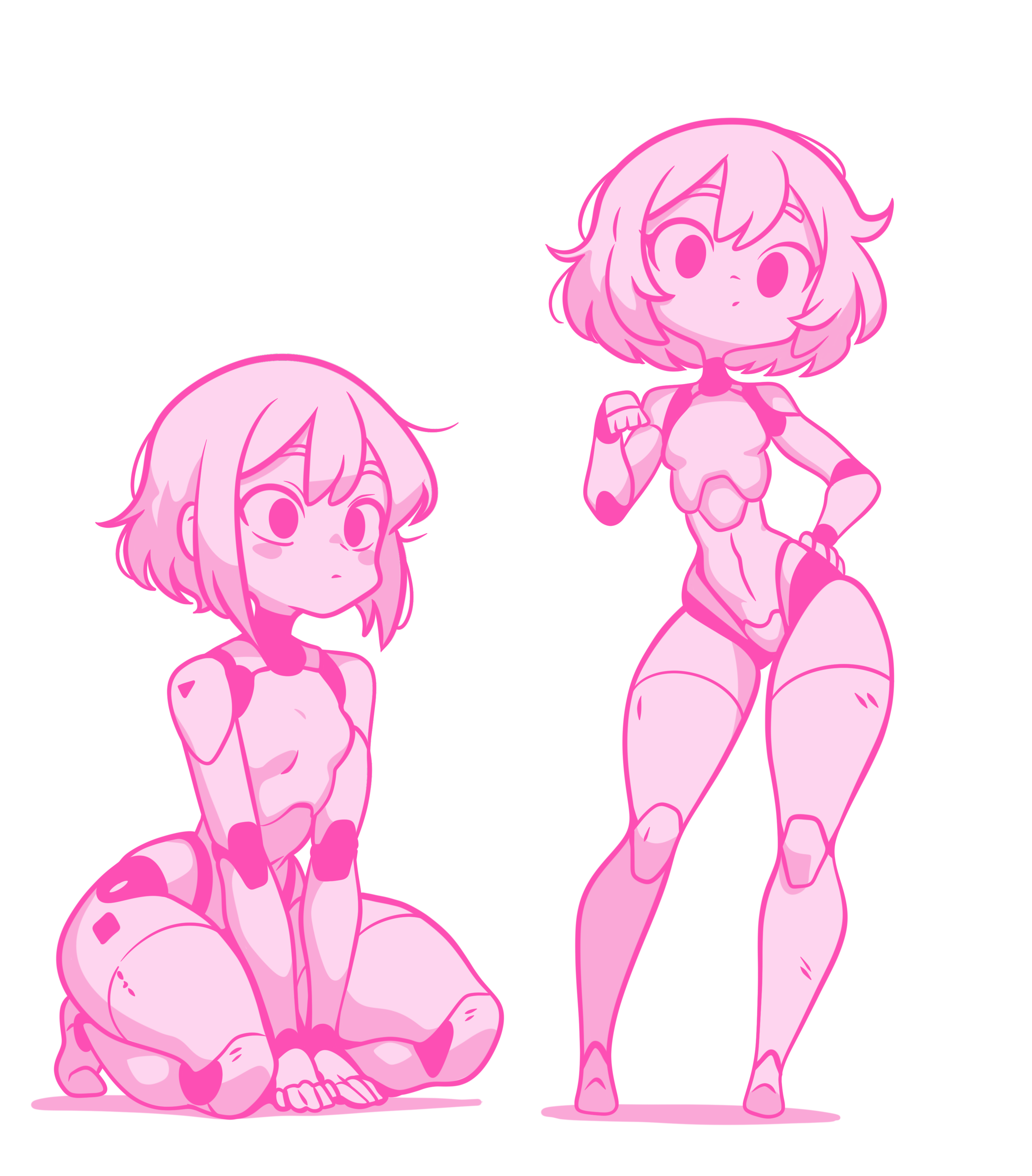
Character Illustration – Luna Automancer
The title character, Luna Automancer, serves as the visual and emotional core of the project. I illustrated her to embody the album’s themes: isolation, defiance, and machinery.

Full character design, illustrated entirely in Procreate and refined in Photoshop for print/digital compatibility.
Physical Packaging Design
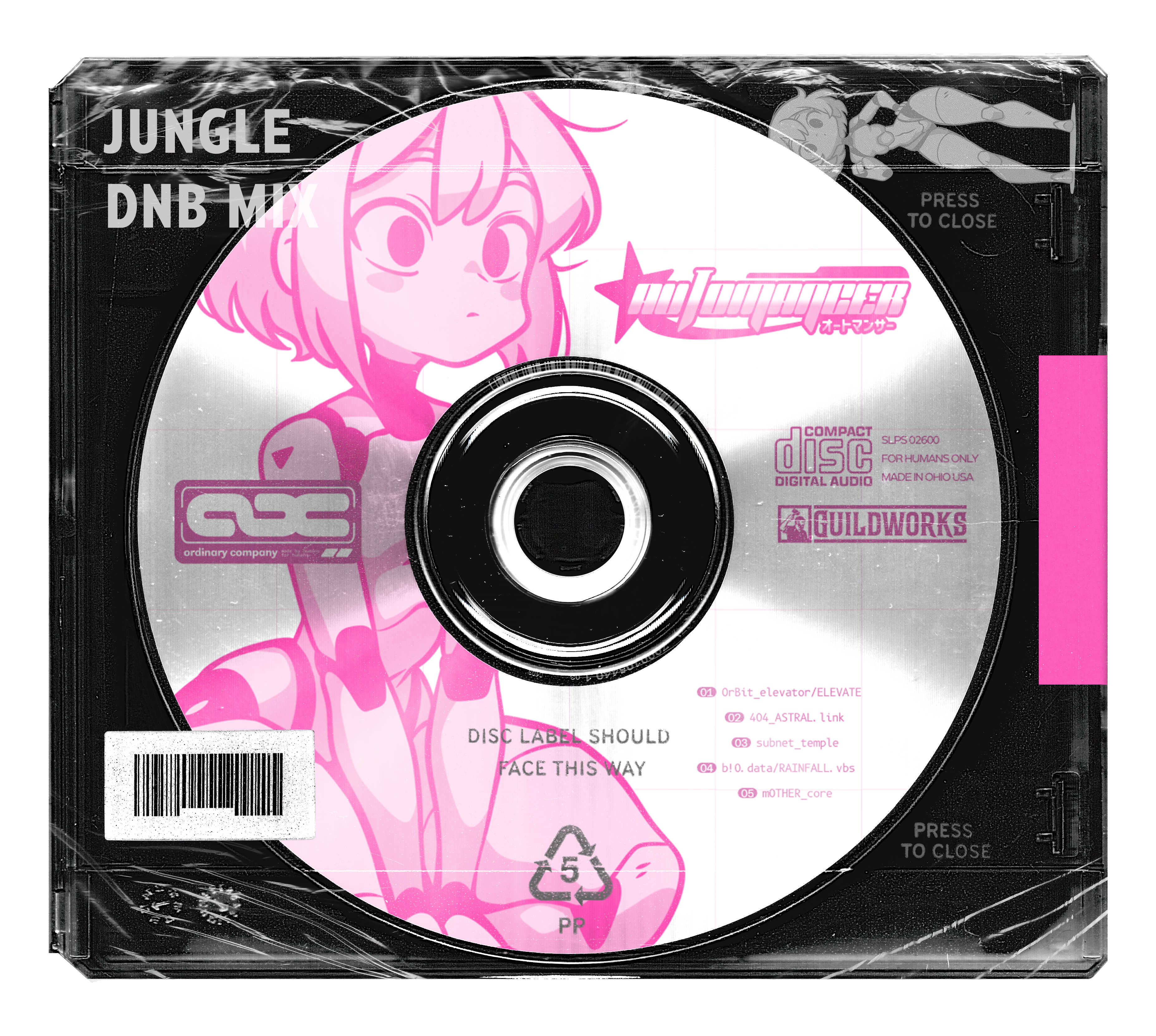
For the physical release, I designed a CD package that captures the texture and nostalgia of mid-2000s music/game media. This includes:
- Jewel case with branded plastic wrap
- Full art Disc/CD design

These assets are being prepped for short-run manufacturing, using single layer silkscreen printing.
Creative Inspiration
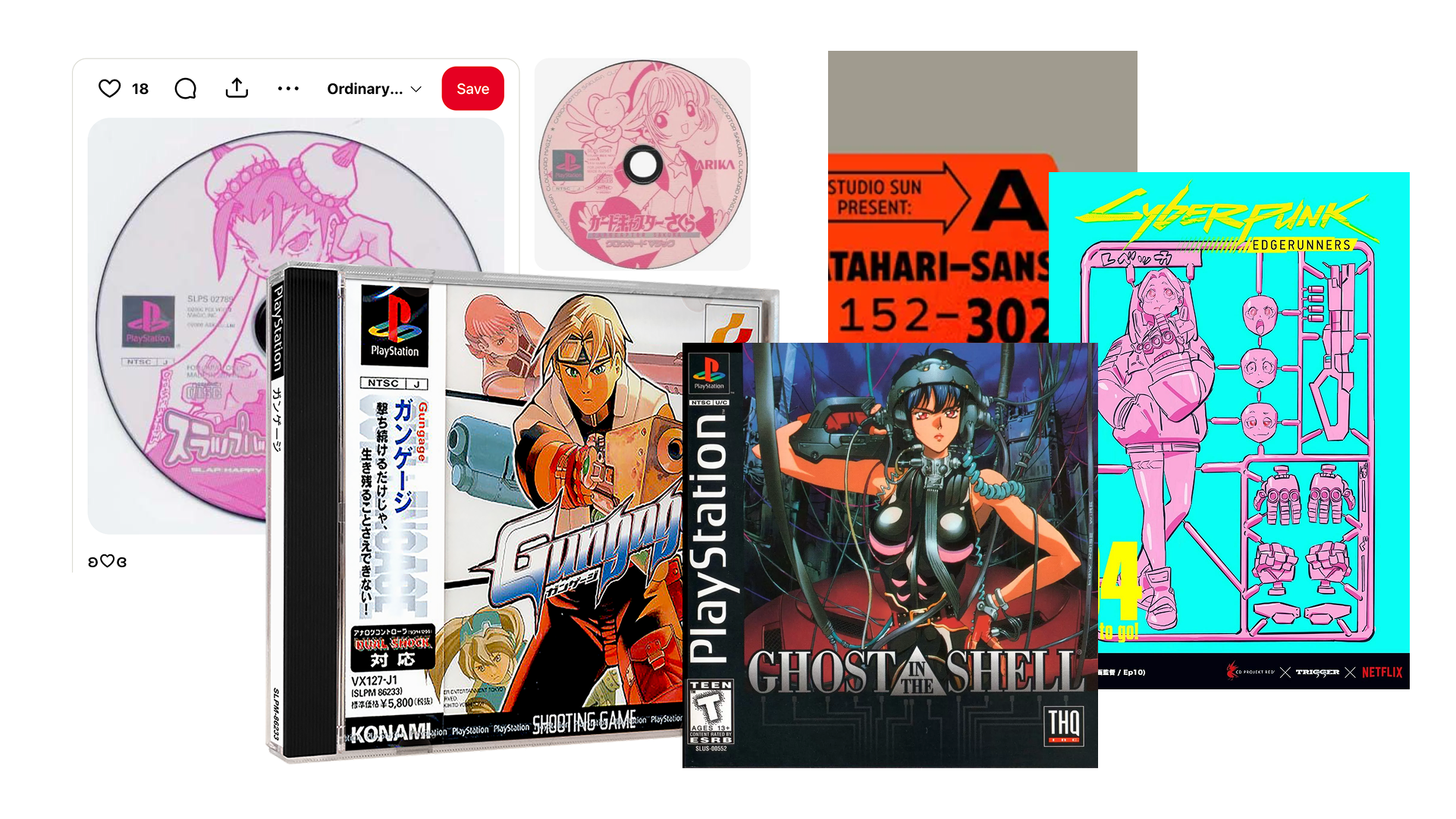
Automancer draws heavily from early 2000s visual culture. Some of the core inspirations included:
- PS1 / PS2 game disc artwork
- Fanmade AMV DVD packaging
- Bootleg music compilations sold at cons and swap meets
The intention was to create something that believably could've existed in 2006, with no winks, no modern design polish. Just straight-up era-authentic chaos.

Closing Thoughts
One of the biggest challenges in this project was also its biggest gift: nearly unlimited creative freedom.
With no brand guidelines or approval loops, I had to self-direct every aspect, and that led to what I call "the depression of choice." When anything is possible, you have to ask yourself:
What should I make?
This taught me the importance of setting personal constraints and curating my own sandbox. That clarity allowed me to fully commit to the creative direction without falling into paralysis.
What I Learned:
- How to build a world from scratch through visuals alone
- The value of era-specific design research
- That "no constraints" can be just as hard as "too many"
Automancer is one of the most creatively fulfilling projects I've worked on, and I can't wait to share the physical release soon.
