
The software displayed here, along with all related processes, is the intellectual property of RoveiQ. All designs, features, functionalities, and software processes are proprietary to RoveiQ and are protected under applicable intellectual property laws. Nothing in this showcase is outside of public knowledge, and no confidential customer data is shared.
Problem
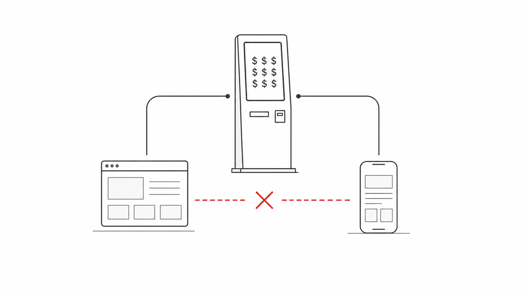
RoveiQ started as a kiosk-first wayfinding company. The flagship product lived on a large physical touchscreen, and for a long time that kiosk was the product we sold.
The company also had two supplemental experiences around it: a web map and a mobile web app that visitors could open from a QR code on the kiosk. They used the same venue map data as the kiosk, but the user experience was different enough that they felt like separate products. For the development team, that meant duplicated work. For customers, it meant the non-kiosk experiences felt secondary. For the business, it meant every software deployment still depended on selling expensive hardware.
That hardware requirement narrowed the market. Some venues needed modern wayfinding, but did not want a physical kiosk. Others could not justify the cost. If web and mobile were going to become real standalone products, they could not keep behaving like accessories to the kiosk.
Solution
The assignment was to merge the web map and mobile web app into one all-encompassing product: a responsive wayfinding experience that could live independently from the kiosk, scale from desktop to mobile, and still feel coherent with the broader RoveiQ platform.
Success meant solving three problems at once:
- Product strategy: turn web and mobile from supplemental tools into a sellable standalone product.
- User experience: create a familiar navigation experience that helped visitors understand where they were, where they were going, and what to do next.
- Operational complexity: reduce the amount of duplicate UX and development surface area the team had to maintain.
The Map Was The Product
Before the interface could carry web and mobile as standalone products, the map itself had to do the heavy lifting. In RoveiQ, the map is not a passive background layer. It is the core experience: the object users read, trust, and act on when they are physically moving through a property.
Every Rove Maps environment starts as a hand-drawn, custom cartographic model of the real place. Those maps are then georeferenced to sit within roughly one meter of real-world accuracy and rendered inside RoveiQ's proprietary in-house mapping platform, Rove Maps.
That level of fidelity mattered because venue wayfinding has a strange tension: the map needs to reflect reality closely enough that people recognize the property, but it also needs to simplify that reality enough that they can make a decision quickly. Too much detail creates noise. Too little detail breaks trust.
The design challenge was to make the interface respect that map. Search, location detail, amenities, and route mode all needed to support the spatial model instead of covering it up or competing with it.
Design principle: the map should feel hyper-local and recognizable, but simplified enough to reduce cognitive load. The interface should help users understand the property faster, not ask them to decode it.
Customers and visitors have often described Rove Maps as "the Rolex" of the interactive mapping industry. That comparison stuck with me because it points to the real differentiator: this was not generic map styling. It was custom, accurate, branded, 3D cartography at a scale most teams cannot produce or maintain.
Action 1: A Shared Responsive Product Model
The first major decision was to stop thinking about "the web version" and "the mobile version" as separate experiences. The product needed one shared mental model with layout behaviors that adapted to device size.
On desktop, the interface became a map-first workspace with a floating sidebar. The panel could hold search, location details, and route steps without permanently stealing the user's sense of place. On mobile, that same panel transformed into a draggable drawer: familiar from native map apps, reachable with one hand, and able to collapse when the map needed priority.
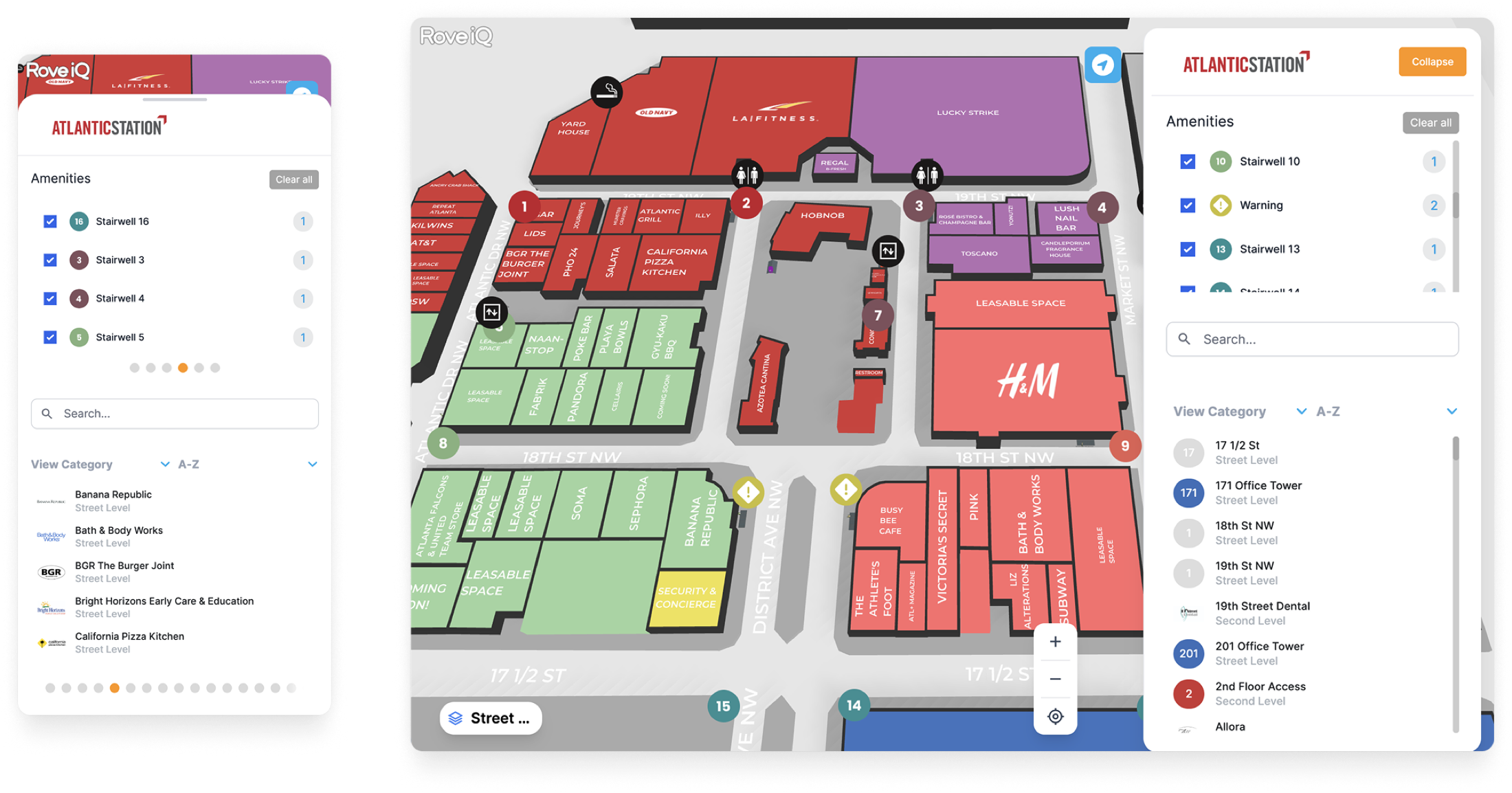
This gave the development team a clearer product target: one interaction system, one hierarchy, one set of UX rules, expressed differently across breakpoints.
Why The Floating Panel Worked
The old interface treated the map and the controls as competing regions. The redesign treats the panel as a temporary layer over the map. That distinction mattered. In wayfinding, the map is not background decoration. It is the user's spatial context.
The floating panel let us:
- keep map context visible while users searched or inspected a place;
- collapse interface chrome when attention needed to return to the route;
- reuse the same interaction pattern across desktop sidebar and mobile drawer;
- create a cleaner foundation for future standalone web product features.
Action 2: Simplifying The Journey From Search To Route
The second major change was reducing the number of steps between discovering a place and understanding how to get there.
In the redesigned experience, selecting a location from the map, sidebar, or mobile drawer immediately reveals the place details. The user does not have to choose the correct object type first or dig through a separate panel. Information appears in context, then the next primary action is clear: start a route.
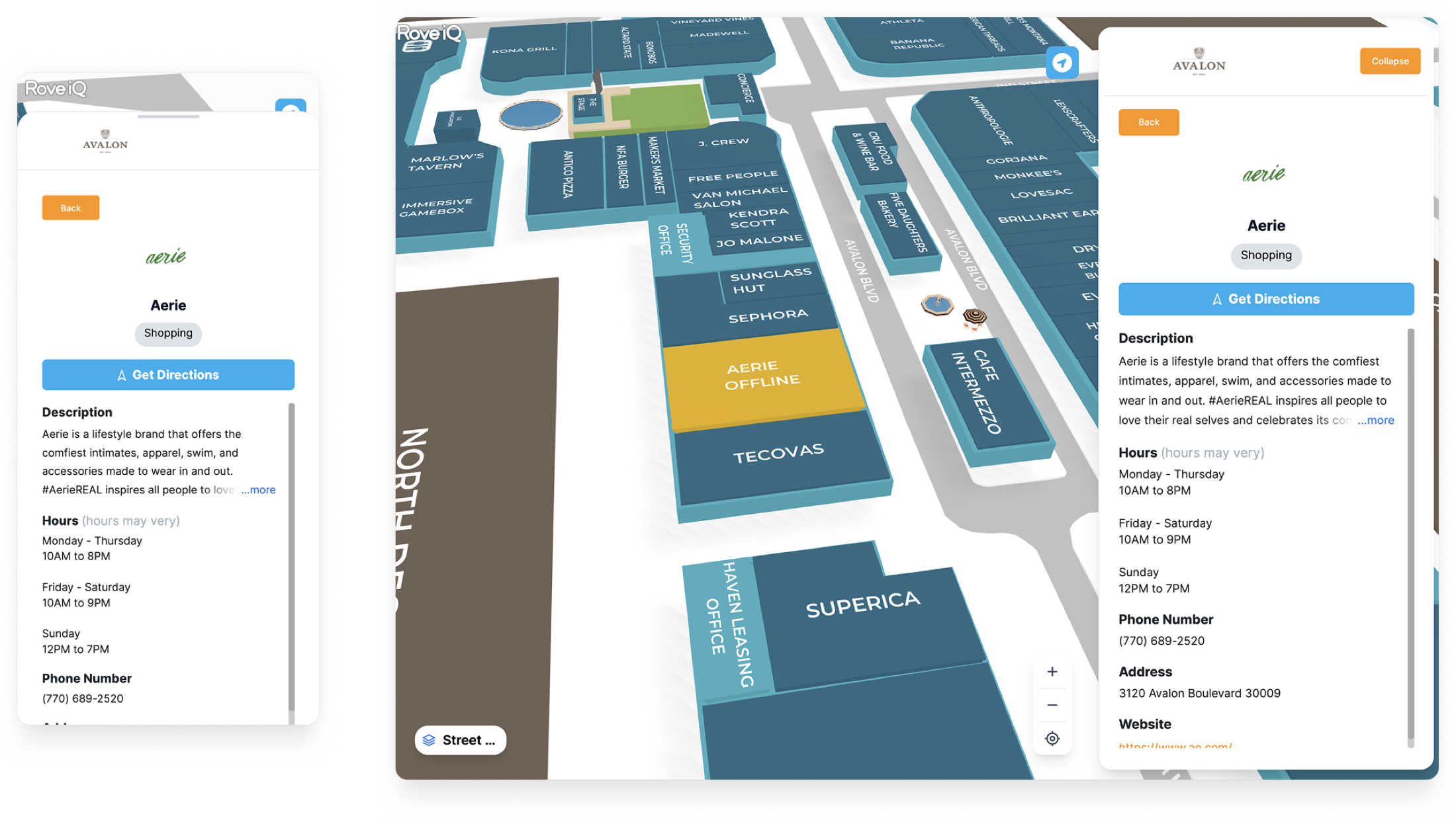
The design goal was not to invent a novel map interface. It was to respect the patterns users already understood from Apple Maps, Google Maps, and other navigation tools, then adapt those patterns to the venue wayfinding context.
That meant stronger visual hierarchy, clearer destination cards, more generous spacing, and route guidance that reads as a sequence of actions rather than a static line on a map.
Action 3: Designing Route Mode For Confidence
The public-facing launch post called route mode the biggest new feature: turn-by-turn walking directions that work with or without GPS data. That distinction is important because venue wayfinding often happens in places where GPS is limited, inconsistent, or unavailable.
For the product to stand alone, routing could not feel like a bonus feature. It had to feel like the core job.
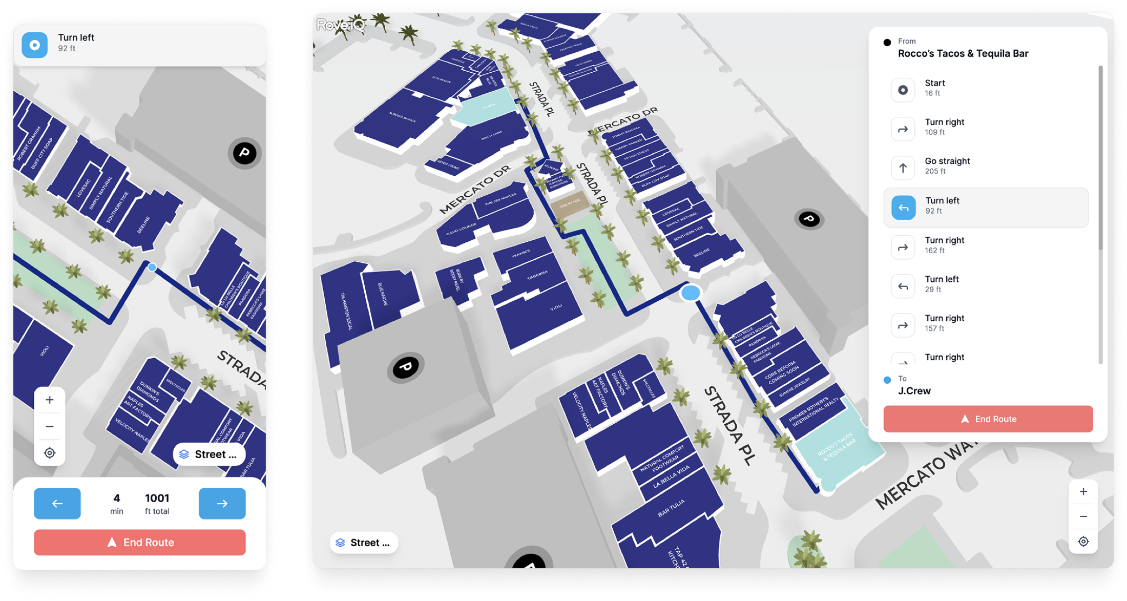
I designed route mode around three states:
- Choose the destination. The user needs enough information to trust they selected the correct place.
- Preview the path. The route should explain itself before motion begins.
- Follow the steps. Guidance should break the journey into understandable turns, floors, and landmarks.
This reduced the ambiguity users called out in testing. Instead of asking "Am I following this line right?", the interface gives them a route state, a next instruction, and a clear relationship between the drawer and the map.
Design Trade-offs
The strongest case studies are honest about what changed and what it cost. This redesign had a few meaningful trade-offs.
Users could rely on existing map-app literacy: drawers, location cards, route previews, and clear primary actions. That reduced learning time for visitors who may only use the product once.
The interface became less visually experimental than it could have been. For a utility product used in unfamiliar physical spaces, predictability was more valuable than novelty.
A shared product model reduced duplication for design and engineering. Customers also got a more consistent experience across desktop planning and mobile on-site navigation.
Some interactions had to be generalized. A mobile drawer and a desktop floating panel do not behave identically, so the design system needed clear rules for where they should match and where each device needed its own behavior.
Result
The redesigned web and mobile product shipped to production as RoveiQ's unified responsive wayfinding experience. The public release positioned it as the company's biggest UI update of the year, bringing together the web map and mobile web app with a redesigned layout, collapsible desktop panel, mobile drawer, toggleable amenities, faster location details, and an all-new route mode.
The business result showed up quickly. Within one month of shipping, RoveiQ onboarded a handful of customers who purchased only the web and mobile experience. They did not buy the kiosk. That validated the core product hypothesis: there was demand for RoveiQ wayfinding software beyond customers who wanted or could afford physical hardware.
The biggest public proof point was Miami Design District. They added RoveiQ to their District Map as a featured tab, then used the platform's custom CSS capability to make the map feel like a native part of their site instead of a bolted-on third-party embed. For a brand with that level of visual polish, seeing the product adopted and styled directly into their digital experience was a huge moment for the team.
Impact: the redesign did more than modernize the interface. It helped expand the product from a kiosk-dependent deployment model into a software product that could be sold on its own and embedded cleanly into a customer's public web presence.
What I Learned
A redesign can be a business model change. This project was not only about making web and mobile cleaner. It changed what RoveiQ could sell, who could buy it, and how much hardware dependency existed in the customer relationship.
Consistency is a product strategy tool. Unifying web and mobile gave users a more coherent experience, but it also gave the team a clearer foundation to maintain and extend. Design systems are most valuable when they reduce ambiguity for both customers and builders.
Wayfinding design is confidence design. People do not open a venue map because they want to explore an interface. They open it because they need to get somewhere. The job is to reduce doubt at every step: where am I, what did I select, where do I go next, and how do I know I am still on the right path?
This project helped me grow from designing screens for a product into designing the product's shape in the market. The interface mattered, but the bigger win was turning a supplemental experience into a standalone platform customers could actually buy.